
Table
Rows and columns for data people read: invoices, members, usage. Plain and read-only, with ready-made cells for people, status, money and actions.
npx wunderui-cli add tablePlayground
Installation
npx wunderui-cli add tableWrites the source into your project with its dependencies and, on first use, the styles - see Installation.
Then import what you need:
import {
  Table,
  TableBody,
  TableCaption,
  TableCell,
  TableFooter,
  TableHead,
  TableHeader,
  TableRow,
} from "@/components/ui/table"
Then use it:
import { Table, TableBody, TableCell, TableHead, TableHeader, TableRow } from "@/components/ui/table"

export function Invoices() {
  return (
    <div className="overflow-hidden rounded-xl border border-border bg-card">
      <Table aria-label="Recent invoices">
        <TableHeader>
          <TableRow>
            <TableHead>Invoice</TableHead>
            <TableHead className="text-right">Amount</TableHead>
          </TableRow>
        </TableHeader>
        <TableBody>
          <TableRow>
            <TableCell>INV-2041</TableCell>
            <TableCell className="text-right tabular-nums">$24,800.00</TableCell>
          </TableRow>
        </TableBody>
      </Table>
    </div>
  )
}
Expected result: A card with a quiet header row reading Invoice and Amount, and one row: INV-2041 in the text colour and $24,800.00 on the right. The row lightens on hover.
When to use
Use Table for
- Rows people read and compare: invoice line items, a list of members, usage per product
- A short, fixed set of columns where every row has the same shape
- A summary row that closes the table with a named total
Use something else for
- Data Table for sorting, filters, bulk actions, column settings and server-side data
- List Group for rows without columns, such as an activity list or a settings list
Cells
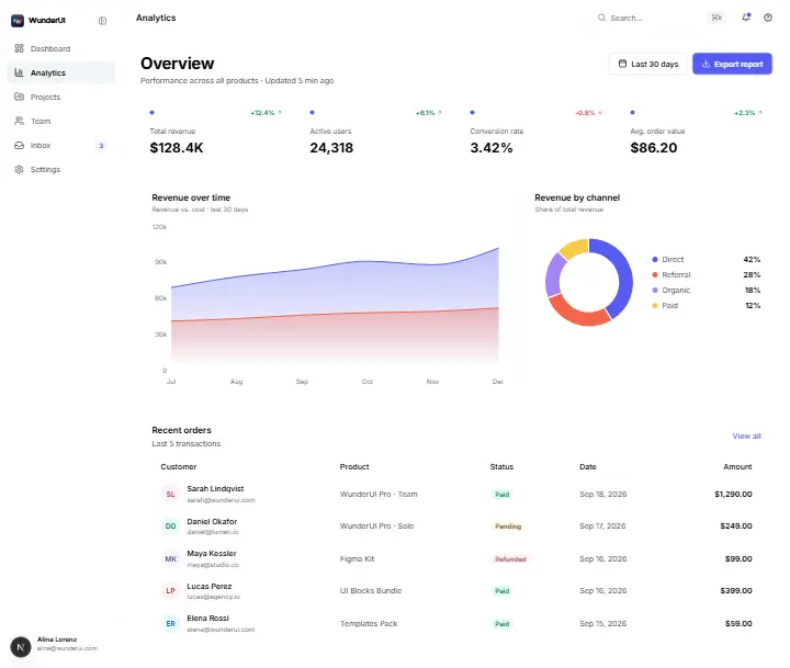
Tables repeat a few shapes, so UserCell, CompanyCell, CurrencyCell, ActionIconsCell and the rest are ready pieces for a TableCell. Every table then shows a person or an amount the same way.
| Member | Role |
|---|---|
NL Nora Lindgreninfo@wunderui.com | Owner |
DO Daniel Okafor | Admin |
PR Priya Raman | Member |
Selection
Table draws a selection, a row marked selected turns subtle, but does not keep it. Put a Checkbox in the first column, and use Data Table for select-all and bulk actions.
Density
Row padding and header height come from the density tokens, so setting comfortable density on the table or any ancestor changes them. Compact is the default.
Width
Cells do not wrap, so a table wider than its card scrolls inside it and takes focus so the arrow keys can scroll. Let a text column wrap where you want it to.
States
A table has no loading, empty or error state of its own. Keep the header, and put skeleton rows, an empty state or an error with Retry where the rows go.
Keyboard interactions
A table isn't a widget, so rows and cells take no focus and have no key commands. Keys work on the scroll region and on the controls in your cells.
- TaborShiftTab
- Moves focus to the next or previous control in a cell: a checkbox, a button, a link or a select. When the table is wider than its card, the scroll region is the first stop.
- ArrowLeftorArrowRight
- On the focused scroll region: scrolls the table sideways. ArrowUp and ArrowDown scroll it vertically when it has a fixed height.
- Space
- Ticks or clears a focused checkbox, or picks a focused radio. The row turns subtle with it.
- EnterorSpace
- Presses a focused button, such as an icon action or the call to action of a row.
Behavior and motion
What the table does with its rows, columns, width and motion.
- Native table
- Table renders a real table inside a scroll box, so screen readers announce rows, columns and headers. Headings are real th cells and the caption is a real caption.
- Row colours
- The header row has the page background. A row lightens on hover, a selected row stays subtle even on hover, and a row with an open menu keeps its hover colour.
- Primary column
- The first cell of a row is in the text colour and the others are secondary, so the eye lands on the name. A leading checkbox or expand button doesn't count, and you can mark another cell as primary.
- Alignment
- Text is left-aligned and numbers are right-aligned with tabular figures, in the cells and the heading above them. A column keeps one alignment from top to bottom.
- Summary row
- The footer closes the table with a line and medium weight. Its first cell names what the row adds up, and the figure sits right-aligned in its column.
- Caption
- The caption sits below the rows by default, and caption-top moves it above. When the page already names the table, hide the caption visually: it stays the accessible name.
- Width
- Cells don't wrap. A table wider than its container scrolls inside it and the scroll box takes focus, and you can let a text column wrap where you want.
- Density
- Header height and row padding follow the density setting. A one-line row is about 33 px by default, and comfortable density makes both larger.
- Missing values
- A value that doesn't exist is an em dash, never 0 and never an empty cell. Hide the dash from screen readers and give them the words No value.
- Loading, empty and error
- The table has no states of its own. Keep the header and put skeleton rows, an empty state or an error with a Retry button where the rows go, marked busy while loading.
- Motion
- Nothing moves. Rows change background on hover and selection, and icon actions change colour, all with short fades.
- Reduced motion
- There is no movement to remove, so reduced motion changes nothing. The short colour fades stay.
Anatomy
The figure marks the invoice table with its caption above the rows and a summary row at the foot. The ready-made cells follow the main parts and go inside a TableCell.
| Invoice | Status | Amount |
|---|---|---|
| INV-2041 | $24,800.00 | |
| INV-2040 | $3,200.00 | |
| INV-2039 | $980.00 | |
| INV-2038 | $12,400.00 | |
| Total | Sum$41,380.00 |
- data-slot="table-container"
A scroll box around the native table. When the table is too wide it scrolls sideways and takes focus so arrow keys can scroll it, and an aria-label names that region.
- data-slot="table"
The native table element. Your className goes here.
- data-slot="table-caption"
The table's title, read first by screen readers. It sits below the rows by default, above them with caption-top, and can be hidden when a heading already names the table.
- data-slot="table-header"
The column headings. It has the page background, so the heading row reads as a quiet band above the rows.
- data-slot="table-head"
One column heading. Right-align it over a column of numbers.
- data-slot="table-body"
The data rows.
- data-slot="table-row"
One row. It lightens on hover and turns subtle when selected, and has no focus ring because it isn't interactive.
- data-slot="table-cell"
One cell. The first cell of a row is primary text and the rest are secondary, and it holds plain text or a ready-made cell.
A row of icon actions such as edit, view and delete.
A row of text actions, with quieter ones for the less common choices.
A street over a city, on two lines.
A checkbox in front of the row label, for picking rows.
A logo square, the company name and its domain.
The filled call to action of a row.
An amount with its currency.
A drag handle in front of the row label.
A column label for a heading cell.
An icon beside a label.
A figure with its change, green when it is good news.
A thumbnail, the product name and its SKU.
A radio button in front of the row label, for picking one row.
A label with a cross to remove it.
Plain cell text in the table's text style.
Like UserCell, but always with an avatar image or initials.
A name over an email address, with an avatar or a person icon.
- data-slot="table-footer"
A summary row, such as a named total. It is set in medium weight and closed off from the rows by a line.
Best practices
- Do
Name the table with a caption, or with an aria-label when the page heading already does. On a table that scrolls sideways, that name also labels the scroll region.
- Do
Right-align numbers, heading included, and use tabular figures so they line up and don't shift when they change. Text stays left.
- Do
Give amounts and quantities their unit. CurrencyCell adds the currency, and for other figures the column heading names the unit.
- Do
Show a missing value as an em dash and give screen readers the words No value. An empty cell looks like a mistake, and a 0 claims something the data doesn't.
- Do
Keep the header while the table loads, is empty or fails, and show the state where the rows go. The columns stay put, so nothing jumps when rows arrive.
- Don’t
Don't set row padding or heights by hand. Rows follow the density setting.
- Don’t
Don't make a row clickable when nothing inside it is. A row has no focus ring or key action, so put a link or button in the first cell.
- Don’t
Don't stack many columns on a phone. A sideways scroll hides the right-hand columns, so pick the few that matter or use a list.
- Don’t
Don't build sorting, filters or paging by hand around a Table. When people need them, use Data Table, which keeps that state for you.
API reference
Table and its parts each render the element they are named after and take its attributes, className, a ref and aria or data attributes. Only Table and the ready-made cells add props.
A scroll box around the native table. When the table is too wide it scrolls sideways and takes focus so arrow keys can scroll it, and an aria-label names that region.
The table's title, read first by screen readers. It sits below the rows by default, above them with caption-top, and can be hidden when a heading already names the table.
The column headings. It has the page background, so the heading row reads as a quiet band above the rows.
One column heading. Right-align it over a column of numbers.
The data rows.
One row. It lightens on hover and turns subtle when selected, and has no focus ring because it isn't interactive.
One cell. The first cell of a row is primary text and the rest are secondary, and it holds plain text or a ready-made cell.
A row of icon actions such as edit, view and delete.
A row of text actions, with quieter ones for the less common choices.
A street over a city, on two lines.
A checkbox in front of the row label, for picking rows.
A logo square, the company name and its domain.
An amount with its currency.
A drag handle in front of the row label.
A column label for a heading cell.
An icon beside a label.
A figure with its change, green when it is good news.
A thumbnail, the product name and its SKU.
A radio button in front of the row label, for picking one row.
A label with a cross to remove it.
Plain cell text in the table's text style.
Like UserCell, but always with an avatar image or initials.
A name over an email address, with an avatar or a person icon.
Notes for AI
Give your coding assistant the Markdown reference instead of screenshots.
get_component("table")npx wunderui-cli add tableThe full library index for assistants is at /llms.txt.