
Product Image
A product photo, or a tinted placeholder with an icon when there is no photo yet. It fills the box you give it: size, ratio and radius come from the classes you set.
Playground
Installation
Product Image comes with WunderUI Core and Pro, in the package from your plan. See the plans.
Then import what you need:
import { ProductImage } from "@wunderui/react"Then use it:
import { ProductImage } from "@wunderui/react"

export function Photo() {
  return <ProductImage tint="indigo" className="aspect-[7/4] w-64 rounded-xl" />
}
Expected result: You should see a 256 px wide rounded rectangle in the indigo tint with a small package icon in its middle. Add src and alt to show a photo in the same box.
When to use
Use Product Image for
- The picture in a product card, a cart line or a recommendation row
- A gallery with a large image and thumbnails
- A tinted placeholder with an icon for products that have no photo yet
Use something else for
- Avatar for the picture of a person, with initials as the fallback
- Product Card for a whole shop tile that already includes the image
- Carousel for several images shown one after another with controls
Content
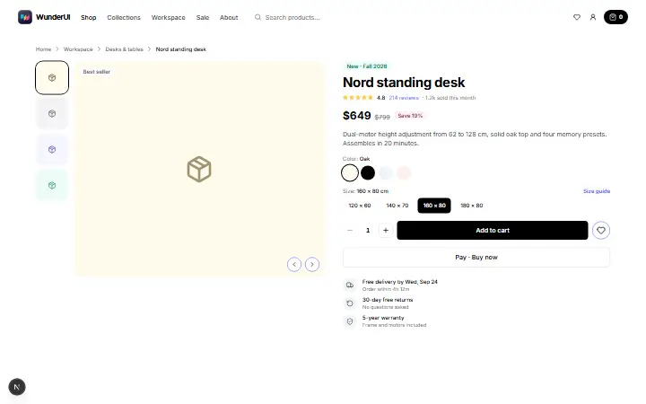
Without a source the tile is a placeholder: a tint with an icon, the package icon by default, or your own. With a source the photo fills the tile and tint and icon are not used.
Tint
The tint colours the placeholder with one of nine tints, and the icon follows the matching text colour. It marks the product in a grid that has no photos yet.
Shape
The component has no size of its own, so classes set the ratio, width and radius. The photo is cropped to the box and never stretched.
Source
Pass a source whenever a product has a photo. If the address fails, the tile falls back to the tint and icon by itself; photos load lazily, so use eager loading for an image visible on open.

Alt text
Alt text is empty by default, which marks the photo as decoration. Pass a description when the image is the only place that shows the product, and leave it empty when the name is written next to it.
Nord standing desk
Corners
An image inside a rounded box takes the box radius minus the distance to it: 16 px around 8 px of padding gives 8 px. An image that touches the edge takes none and lets the box clip it.
Behavior and motion
What the image does with its content, size, source and text. It is display only, so there is no hover, focus or keyboard behaviour.
- A tile, not a control
- Product Image is a plain span with no role and no focus. To make a thumbnail pressable, wrap it in your own button, as the gallery example does.
- Photo
- The photo fills the tile and is cropped to fit, never stretched, and a radius on the tile rounds it too. It loads lazily, so set eager loading for the first image above the fold.
- Placeholder
- Without a source the tile shows the tint and an icon: by default a package icon at a quarter of the tile, 16 to 32 px. A custom icon keeps its own size; give non-Lucide SVGs aria-hidden.
- Tint and icon with a photo
- The tint and icon belong to the placeholder. When a photo is set they are not used, and the tile has no background behind it.
- Size and radius
- The tile has no size, ratio or radius, so set them yourself. Without a size a photo takes the full width of its container at its own ratio, and a placeholder collapses around its icon.
- Loading and errors
- There is no loading state: the photo appears when the browser has it. If the address fails, an error handler is called and the tile falls back to the placeholder until a new source arrives.
- Alt text
- The alt text is empty by default, so screen readers skip the photo. Pass a description when the image carries information the page does not say elsewhere.
- Motion and reduced motion
- Nothing is animated: the photo does not fade in and the fallback appears at once, so reduced motion changes nothing.
Anatomy
The parts of a product image, numbered in the figure: one component that draws the photo or the placeholder icon. The figure shows a placeholder on the left and a photo on the right.
- data-slot="product-image"
A span that centres and clips its content, with no role. It has no size, ratio or radius of its own, so pass all three as a class.
An image that fills the tile and is cropped to it. It shows when a source is set and has not failed, loads lazily and has an empty alt unless you pass one.
The placeholder icon, shown when there is no source or the photo failed to load. It is a package icon by default, a quarter of the tile (16 to 32 px), in the tint's text colour.
Best practices
- Do
Always set a size: a width and a height, or a width and an aspect ratio. The ratio also keeps the page from jumping when the photo arrives.
- Do
Give the image the radius of its box minus the distance to it. In a 16 px box with 8 px padding use a medium radius; an image that touches the edge takes none and lets the box clip it.
- Do
Keep the alt empty when the product name is written next to the image. Pass a description when the image is the only place that shows the product.
- Do
Pass the photo address whenever a product has one, even if it might fail. If it does not load, the tile falls back to the tint and icon by itself; an error handler lets you log the broken address.
- Do
Give a custom icon its own size class, such as size-8. The default icon sizes itself from the tile; yours does not.
- Don’t
Don't treat the placeholder as final content. It holds the place of a photo that does not exist yet.
- Don’t
Don't expect a loading state or a fade-in. The tile stays empty until the browser has the photo, so reserve the size with a ratio, or show a Skeleton while you fetch the address yourself.
- Don’t
Don't pass a tint or icon together with a photo and expect to see them. With a photo they are not drawn, so a transparent photo shows the page behind it.
API reference
Product Image is one component with the props below. It renders a span and takes no other attributes, so an id or data attribute cannot be passed; the error and loading props go to the photo.
A span that centres and clips its content, with no role. It has no size, ratio or radius of its own, so pass all three as a class.
Notes for AI
Give your coding assistant the Markdown reference instead of screenshots.
get_component("product-image")The full library index for assistants is at /llms.txt.