201 React components. One Figma library. Ready for your AI agent.
Components, 56 UI blocks, motion and tokens in light and dark — with DESIGN.md and an MCP server, so coding agents build with the system instead of guessing.
Live demo
The demo is the real library: switch views, drag a card, sort the table, change the accent.
Your stack and your agent — no adapters.
- ReactReact
- Tailwind CSSTailwind CSS
- Base UIBase UI
- FigmaFigma
- ClaudeClaude
- ChatGPT & CodexChatGPT & Codex
- CursorCursor
- WindsurfWindsurf
- GeminiGemini
- GitHub CopilotGitHub Copilot
- v0v0
- + any MCP client
The design system that never guesses. One prompt, one consistent screen.
Say what you need. One sentence to your agent.
It reads before it writes. Rules, tokens and 201 components over MCP.
It reads first. Rules, tokens, components.
6 components matched to your prompt
- KPIGroupFour figures with trend chips
- AreaChartRevenue over twelve months
- DataGridLatest deals, sortable
- SidebarWorkspace navigation
- BadgeDeal stage, tint colours
- NavbarSearch, bell and account
No invented values. Every value is a token.
Assembled, then checked. Only parts that already exist.
The prompt fans out into reading DESIGN.md, loading the tokens and matching components; they meet in one composed screen, which is checked for raw values before it is rendered.
Same names on both sides. Change one, the other follows.
 Figma · KPI Card
// tokens.css — from the Figma variables
--primary: #555CF3;
<MetricCard label="Revenue" value="$48.2k"
trend={{ value: "12.4%", direction: "up" }}
aside={<MetricSparkline variant="bar" />} />Pick a colour in the Figma variables — React follows.
Nothing ships unchecked. Contrast, focus, motion, mobile.
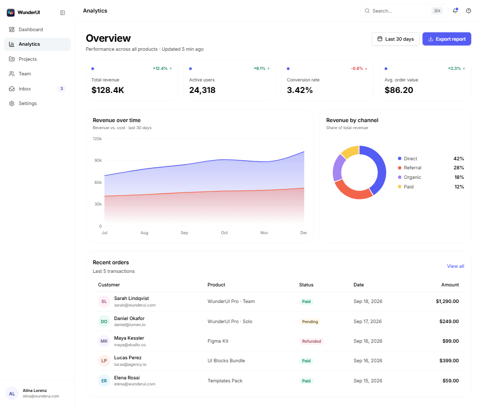
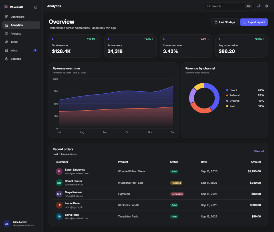
Audit · Revenue dashboard
- ContrastAA in light and dark
- Tokens only0 raw values
- Focus1 px indigo, every control
- MotionOn duration tokens
- Mobile 390 pxNo sideways scroll
Ship it everywhere. Light, dark and mobile from one build.
Everything in the box. Components, blocks, motion, templates.
201 Components
Every size, state and variant in React and Figma, with live examples.
56 UI Blocks
Finished screens for apps, data, commerce and AI, light and dark.
180 Motion-Effects
Entrances, hovers and loaders on WunderUI's motion tokens.
Pre-Built Templates
Whole pages built only from WunderUI — open, click through, reuse.
Design & Code Aligned
A Figma file and a React library with the same names, props and tokens.
Tokens & Dark Mode
Colour, type, radius and motion tokens; one switch turns it all dark.
Fully Responsive
Layouts reflow to phone size; every block has a mobile variant.
MCP & Skill
Your agent builds over MCP; skills check the result against the rules.
201 components. Every one documented and live.
Screens, superfast. Written with real components.
One system, three places. Figma, React and MCP.
Figma library. 201 components, 2,549 variants, one theme collection.
- Variables, not hex
- Light + dark modes
- Auto layout throughout
Local variablesLena Park
Revenue, this month
React library. Same names and props as in Figma.
- 201 components
- TypeScript types
- One import
 MetricCard
<MetricCard label="Revenue" value="$48.2k" trend={{ value: "12.4%", direction: "up" }}/>Your agent, over MCP. Claude, Cursor, Codex and Copilot build with both.
- MCP server
- DESIGN.md + llms.txt
- Audit skills


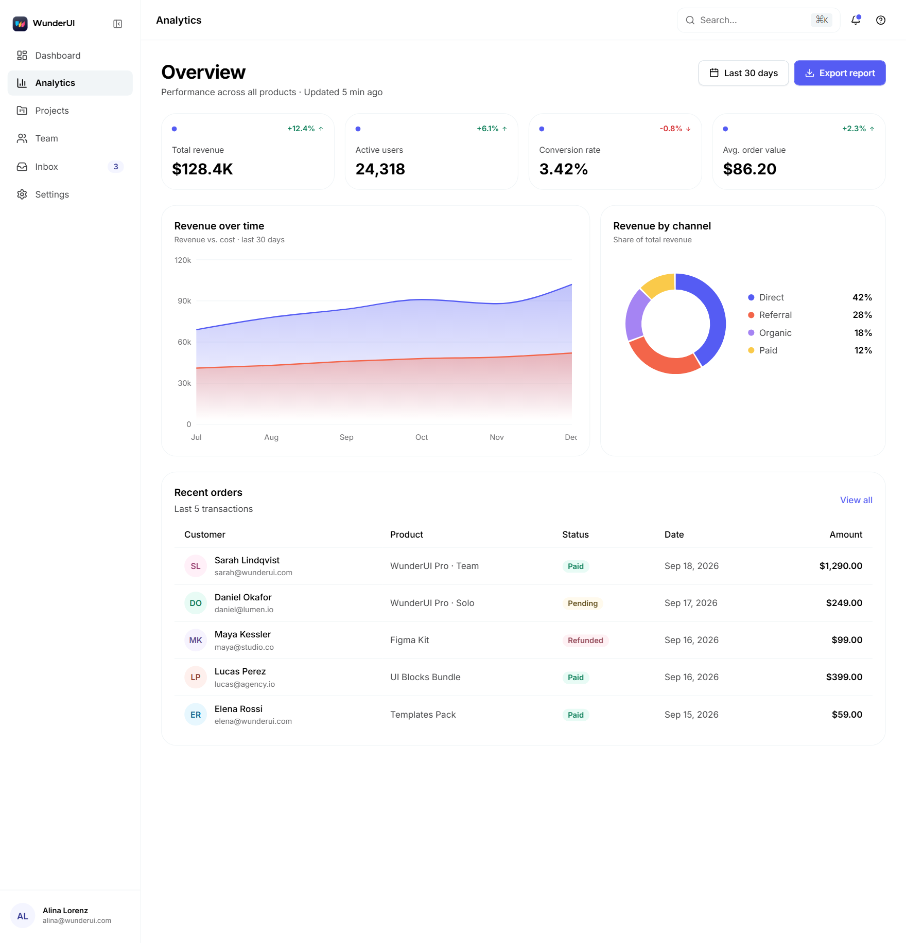
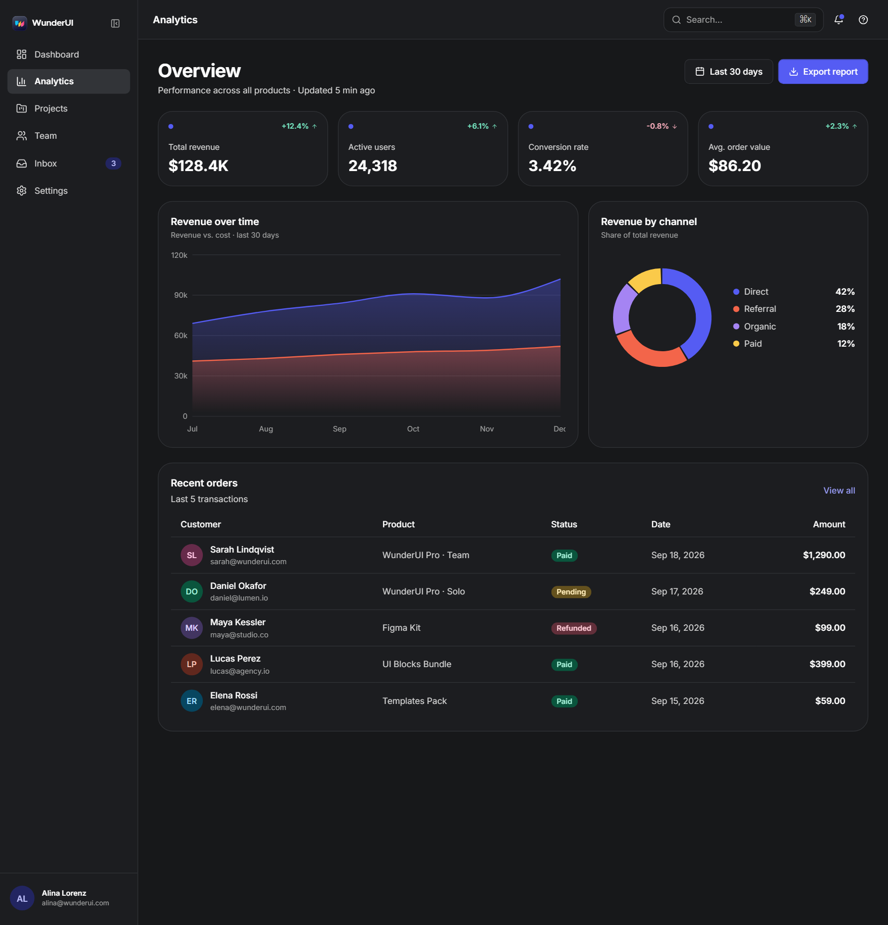
314 finished screens. Light and dark, real source.
Application & Dashboard.
13 blocks · 80 screens
AI & Chat.
11 blocks · 60 screens
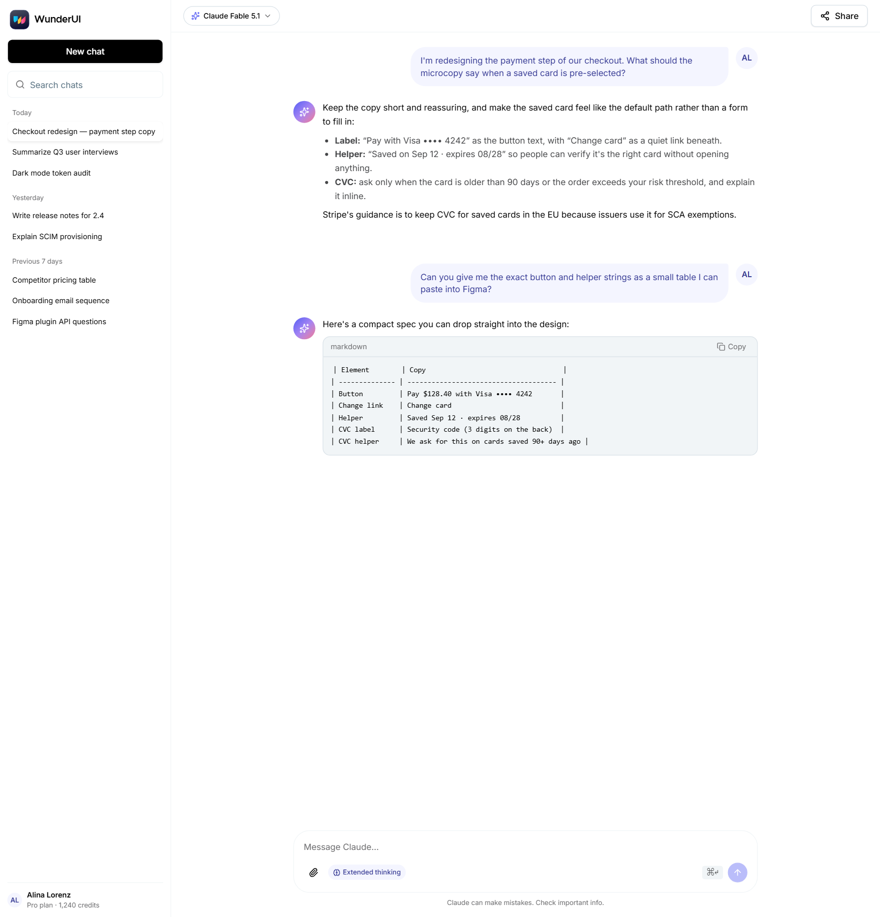
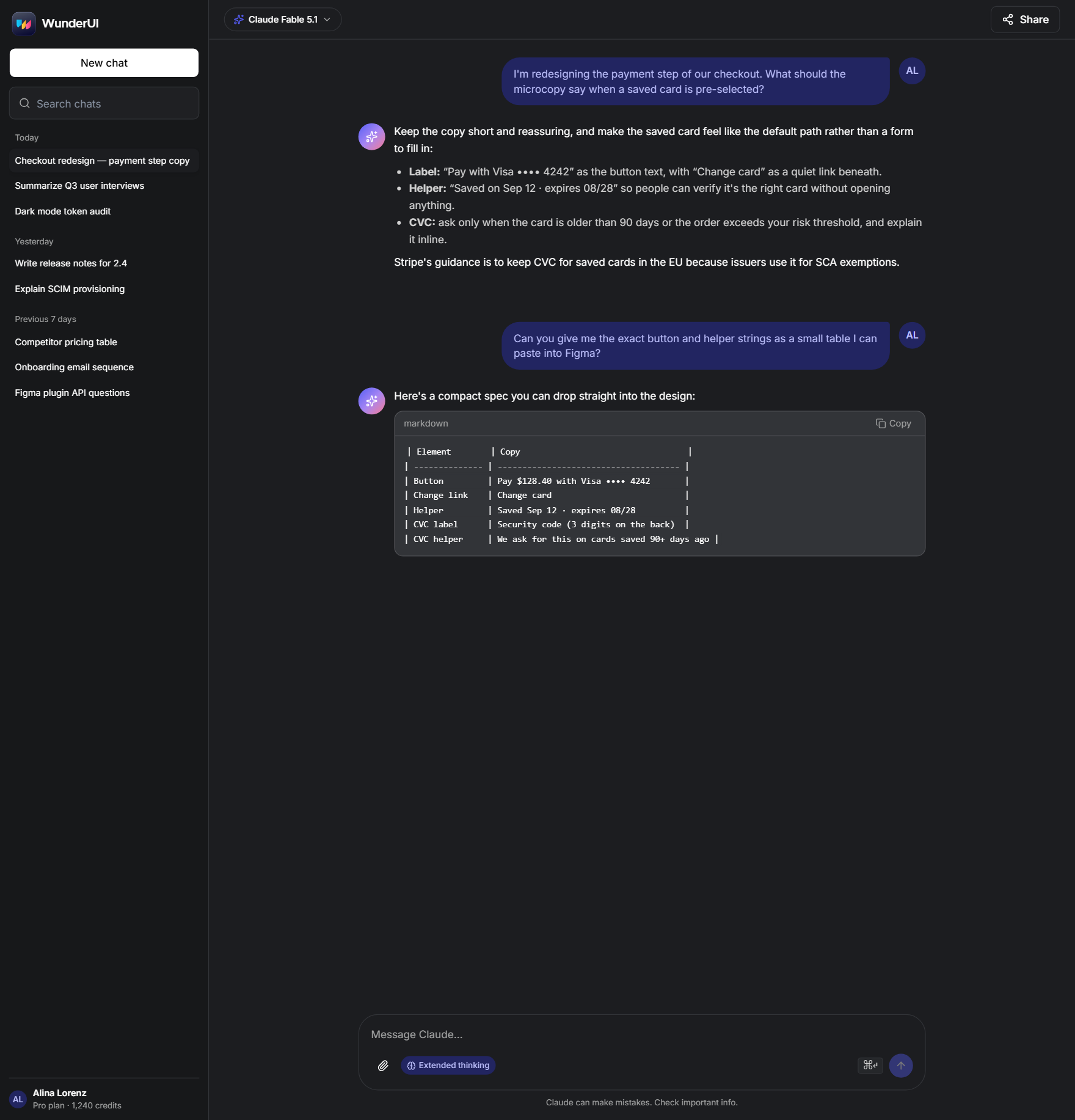
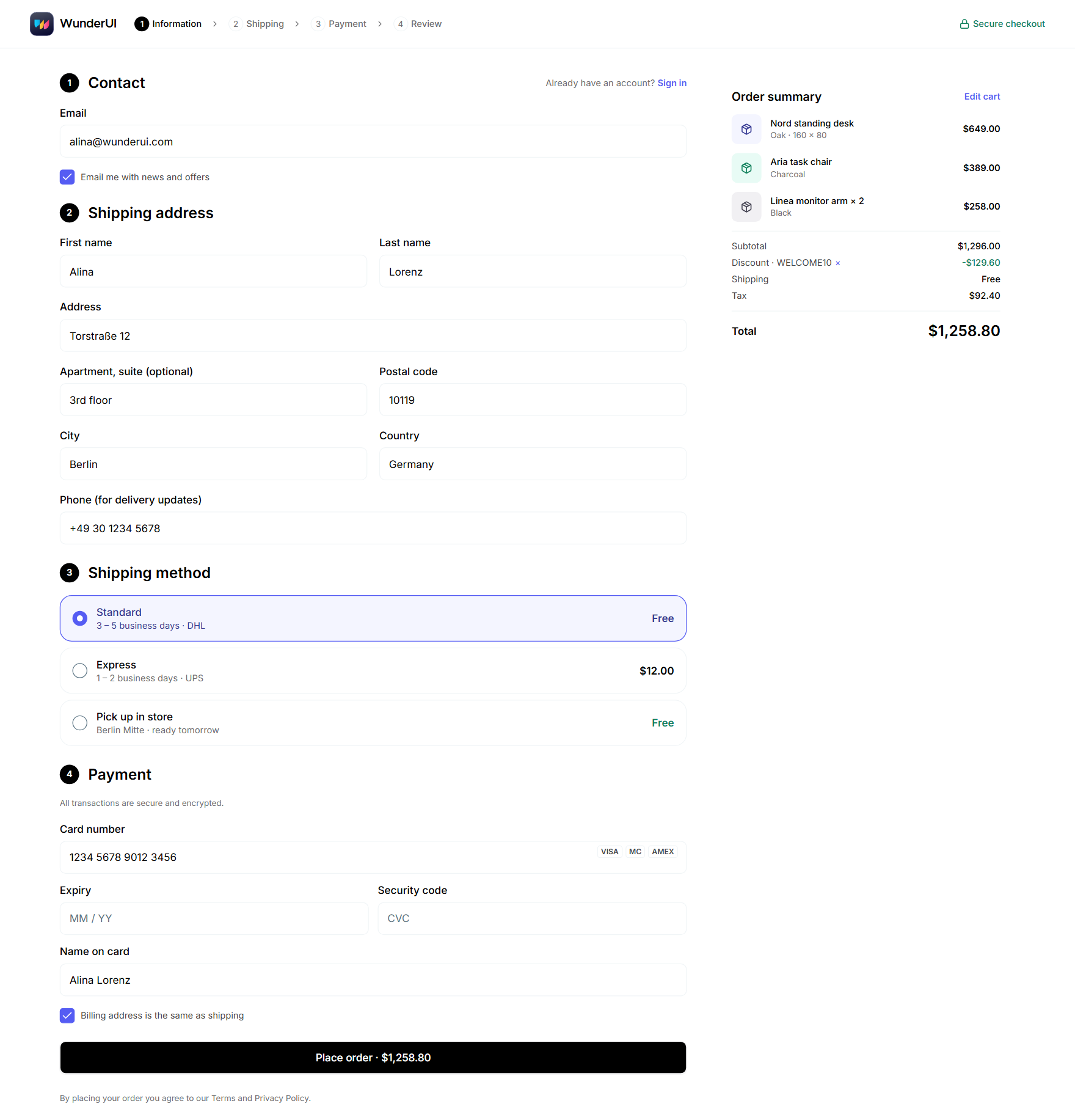
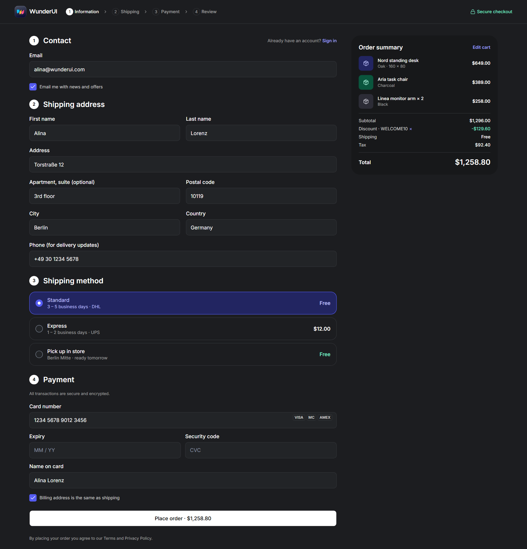
One colour in. Every component follows, in light and dark.
Read the release notes.
Read the release notes.
The colour becomes step 600; every other step, the link, the tint and the focus ring are derived from it and checked against WCAG AA. The output is one theme.css.
Every move on tokens. Ready to ship.
See moreSix duration tokens, from an 80 ms press to a 700 ms data fill. Every transition in the library picks one — none invents its own.
Four curves: entrance, exit, move and overshoot. Things arrive fast and settle; they leave quicker than they came.
Entrances, hovers, loaders and text effects, ready to copy — all running on the same tokens, so they re-time together.
Every animation has a still version. With reduced motion switched on, the finished state is shown — nothing is hidden behind it.
One loop. From variable to screen and back.
Figma library, token set, React components, agent context, your screen; the screen is audited before the merge, and findings go back to the token set, whose values are changed in Figma first.
One dependency. No CLI step.
~/my-app $
- 1
Install the package
One dependency. Nothing is copied into your repository.
- 2
Import the stylesheet
Tokens, light and dark — one CSS file.
- 3
Use a component
Import it by the name you saw in Figma.
app/layout.tsx
import "@wunderui/react/styles.css"
import {
  Button,
  DataGrid,
} from "@wunderui/react" Tailwind CSS4
 Base UI1.8
The next screen is already built
Every UI block is made only from this package. Copy one in and it already runs on your tokens — light, dark and on a phone. Dashboards, settings, checkout, AI chat: start from a finished screen, not a blank file.
Browse the blocksStart free. Grow into Core or Pro.
Every paid plan is billed yearly and includes continuous updates while it runs.
Solo licence: WunderUI Free $0, WunderUI Core $199, WunderUI Pro $299
WunderUI Free
$0forever
Try the system, ship the basics.
For everyone
- The free Figma preview file
- Core React components, ready to copy
- 3 free agent skills — setup, screens, token check
- Free license — personal use only
- No commercial use, full Figma file, Pro components, motion, MCP or updates
WunderUI Core
$199/ year
Figma and every React component.
One named developer or designer · billed yearly
- The full Figma file — components, variants, light and dark
- UI block screens in Figma
- Every React component, ready to copy
- Design tokens
- The motion library
- WunderUI MCP server and registry for Core
- Continuous updates
- Standard Commercial License
- No Pro agent skills, block source code or templates
WunderUI Pro
$299/ year
The full library — for you and your agent.
One named developer or designer · billed yearly
- Everything in Core
- All 10 agent skills and 3 AI agents — Figma, coding agents and the Design Auditor
- UI blocks and templates, source included
- WunderUI MCP server and registry for the full library
- New components and templates as they ship
- Continuous updates
- Standard Commercial License
| Feature | Free | Core | Pro |
|---|---|---|---|
| Price | $0 | $199/year | $299/year |
| Design | |||
| Figma design systemThe full Figma library: 165 components with 2,549 variants and all their properties, plus 2,866 icons — built with auto layout and ready for your own screens. | Free preview | 165 components · 2,549 variants | 165 components · 2,549 variants |
| Design tokensColour, radius, spacing and type as Figma variables and CSS variables, with the same names on both sides and light and dark modes. | |||
| UI block screens in FigmaEvery UI block screen as a Figma frame in light, dark and mobile, built from the library components. The React source of the blocks comes with Pro. | |||
| Code | |||
| React components201 accessible React components (76 of them free): forms, feedback, overlays, core elements, navigation, KPI cards, charts and AI. The same names, props and variants as the Figma library — copy the code or install them, typed and themeable. | 76 core components | 201 components | 201 components |
| Data & Charts14 components: area, line, bar, column, candlestick, sparkline, pie, radar, radial, bubble and funnel charts plus the data grid, with 260 ready-made chart variants in Figma and React. Every chart has a loading state and an appear animation. | 14 components | 14 components | |
| AI & Agents components45 components for AI products: chat, prompt input, tool calls, approvals, agent plans, run timelines and cost meters. | 45 components | 45 components | |
| Motion effectsThe motion catalogue: 180 copy-ready effects in 13 categories — buttons, cards, text, loaders and AI interfaces — plus the duration and easing tokens behind them. | 180 effects | 180 effects | |
| Theme BuilderPick a brand colour and get the whole colour scale, checked for contrast, as CSS you can paste into your project. | |||
| Blocks & templates | |||
| UI blocksFinished screens such as dashboards, auth, settings, billing, chat and data views, with source code, in light, dark and mobile. | |||
| Page templatesComplete multi-screen templates you can start a product from, such as the dashboard, inbox, settings, sign-in and agent workspace. | |||
| New templatesEvery template released while your plan is active. | |||
| AI & agents | |||
| WunderUI MCP / registryThe MCP server and the component registry: your coding agent looks up components, props and tokens and installs them by name. | Core library | Full library | |
| Free agent skillsSetup, Screen and Token check: set up WunderUI in a project, build complete screens with all their states, and replace hard-coded values with tokens. | 3 skills | 3 skills | 3 skills |
| Basic AI skillsDESIGN.md, design.json and llms.txt: the files that teach any coding agent your tokens, components and rules. | |||
| Figma AI skillsFigma screen and Figma sync: build WunderUI screens in Figma from library instances, and keep Figma variables and the CSS tokens in sync. | 2 skills | ||
| Coding agent skillsMotion audit, Accessibility, Agent UI and Compose: audits with patches, agent interfaces and whole pages built from blocks. | 4 skills | ||
| AI agentsBuilder, Reviewer and Figma designer: Claude Code agents that combine the skills into one job. | 3 agents | ||
| Design AuditorThe UI/UX audit skill: checks a website, landing page, codebase or Figma file against 497 rules and writes a prioritised report. | |||
| Guides & updates | |||
| Guides & documentationStep-by-step guides for installation, theming, the CLI, the foundations and building with AI, plus a live example for every component. | |||
| New componentsEvery component added to the library while your plan is active. | |||
| Continuous updatesFixes and improvements to everything in your plan, for as long as the plan runs. | |||
| LicenseFree: personal, non-commercial use only. Standard Commercial License: unlimited commercial projects — Solo for one named person, Team for up to 5 users in one organisation, client work included.Read the license agreement | Free license · personal use | Standard Commercial | Standard Commercial |
The whole documentation is open before you buy — components, blocks and every code example.
Questions before you pay.
Product

Designed in Figma. Built in React. Shipped by your agent.
Every component, block and code example is open before you pay.